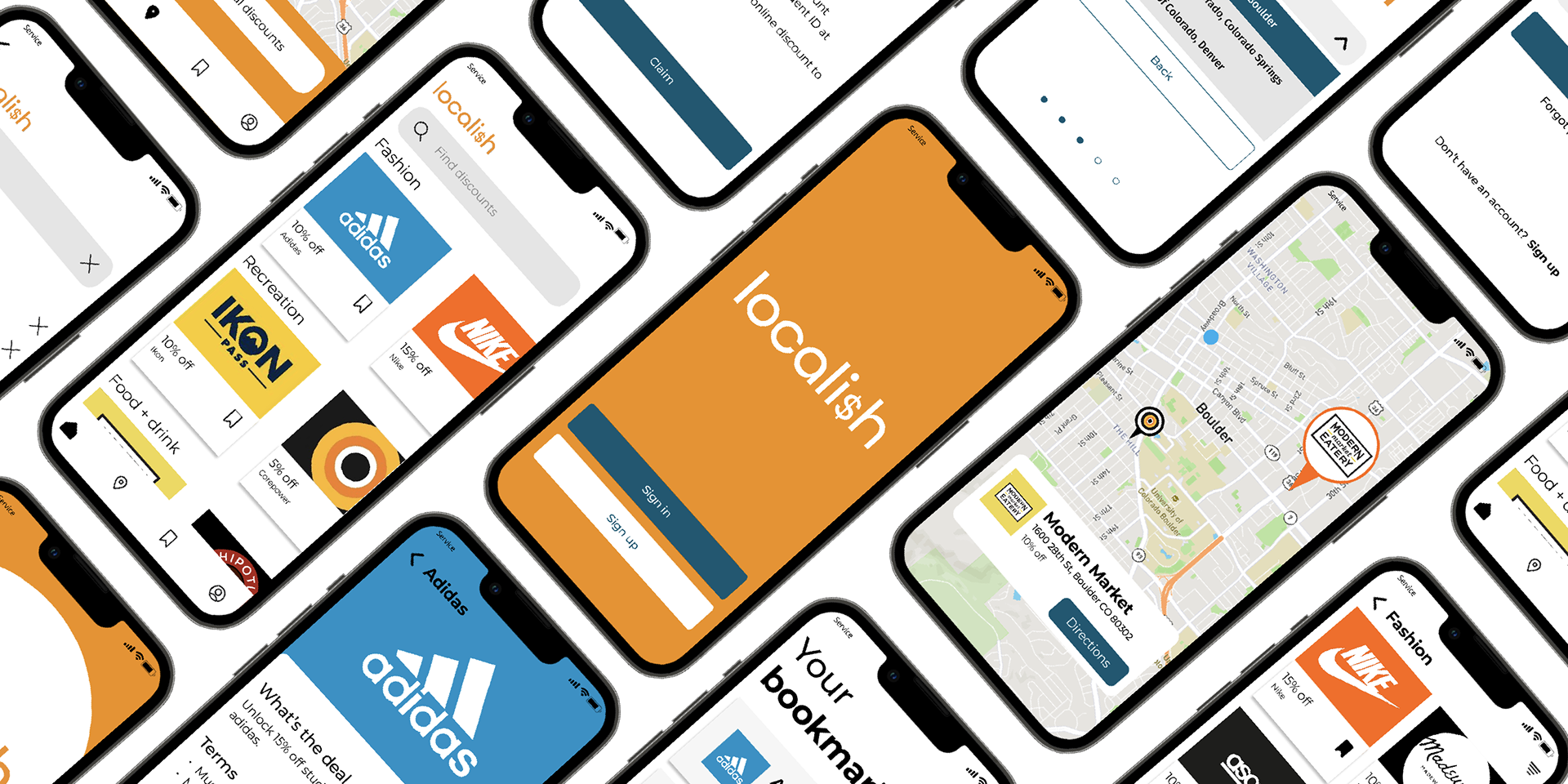
Localish is a local student discount finder app that provides a space for college students to browse local offerings that can save them money.
Responsibility: UX Design
Software Used: Figma
Project Duration: 16 weeks
Overview
The Problem
Students are often unaware of discounts in their local area. This project addresses the lack of knowledge of these discounts. Because many college students are on a budget, these discounts often are the reason they can purchase certain items or attend certain events.
The Solution
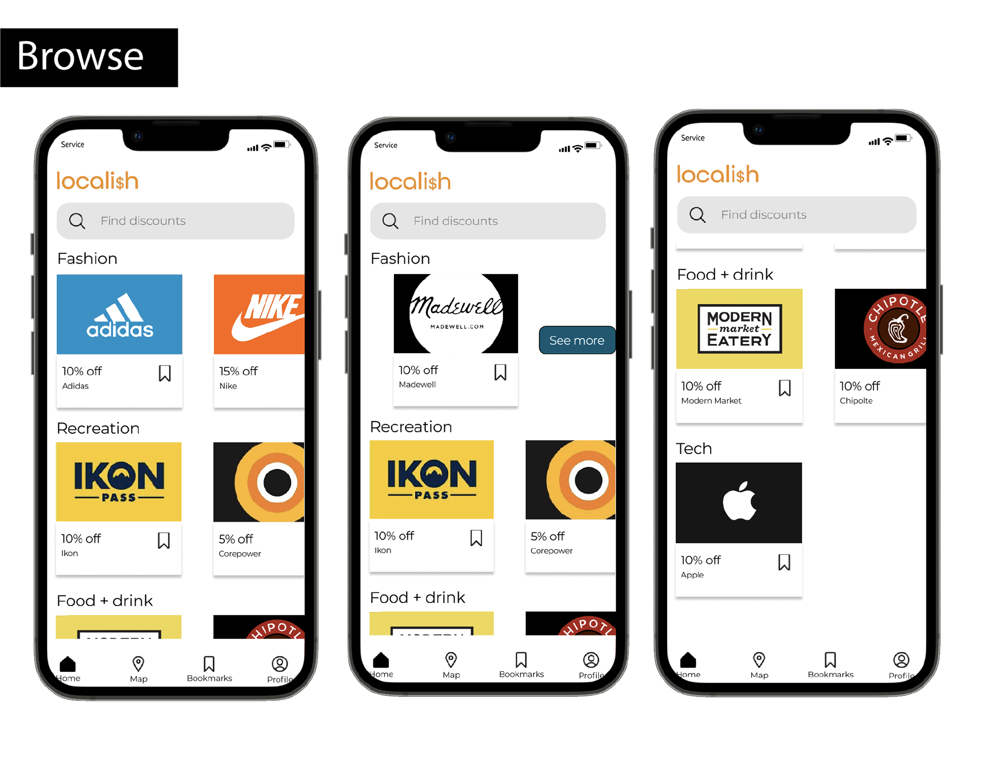
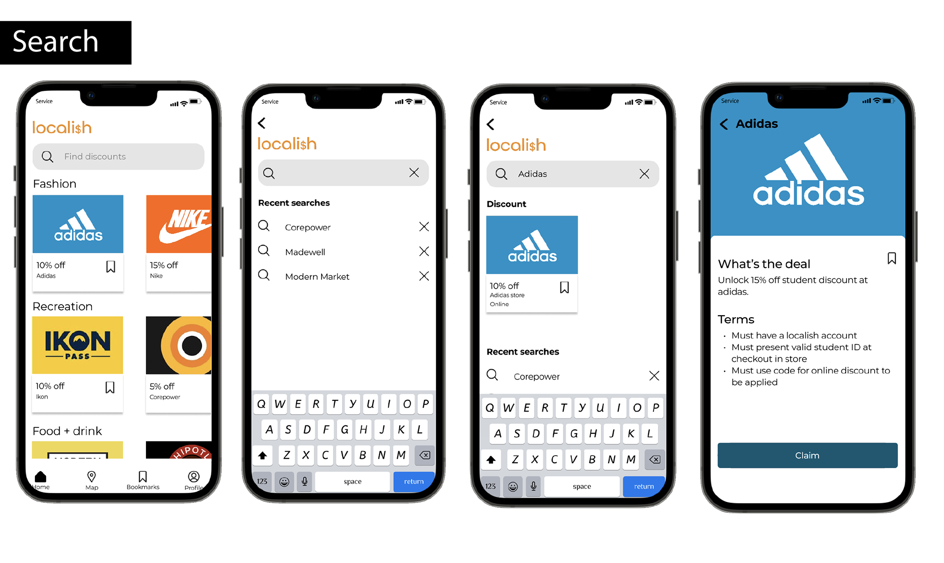
My solution is an app that focuses on displaying local establishments near the user as the primary way to find discounts so that students can capitalize on instances where they can save money near them.
Defining the Problem
Student discounts are all over the place, yet many students are unaware that they exist, especially in their local area. A challenge is that many discounts are spread via word of mouth rather than posted in locations likely seen by college students. Limited by my knowledge of student discounts local to Boulder (a college town), the app spans this area.
Project Timeline

Research
Summary of Research Methods
User Interviews: conducted six 1:1 interviews lasting 30 minutes each
Competitive Analysis: identified three competitors
Research Plan Summary
Background
This research study is to support the development of a student discount finder app and learn more about how students find discounts.
Goals
Discover what methods are currently used to find student discounts
Learn what type of discounts students like to use
Learn more about student's desire to find discounts
Sample Interview Questions
How do you typically find student discounts?
Tell me about the last time you used a student discount.
Why do you use student discounts?
What are some student discounts you know about?
What student discounts do you currently use?
How much did the discounts save you?
How did you find those student discounts?
What are the best student discounts you have found?
In what area(s) would you be interested in finding discounts?
Have you ever sought out a student discount and not found it? What company was it and where did you look?
Methodology
This will be a 1:1 interview consisting of 6 participants. Each participant session will last 30 minutes. Interviews will happen over the phone with a list of pre-screened
Participant Screening
Age range 17 - 23
Currently attending a university
Has used a student discount in the past year
User Interview
Why do you use student discounts?
"To get best price or benefits"
"Easy to show student ID or email"
How do you typically find student discounts?
"If app has notification I see it but don’t really know"
"Hear from friends"
"Following CU accounts"
How much did the discounts save you?
"Half the normal amount of money spent on for my Ikon Pass"
"3% of the monthly payments"
If you were to put a percent or number on discount that made it worthwhile what would that be?
"15-20%"
"20 percent or higher"
"30-50% off"
Affinity Mapping
I categorized the data drawn from the user interviews into a map to find insights in the data
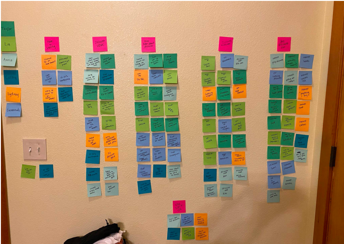
Relevant Findings
Word of Mouth - Student discounts are found by word of mouth from friends who have used them before
Local Establishments - Discounts are often used in the areas local to the student
Not Knowing of Discounts - Many discounts in local area unknown to the students
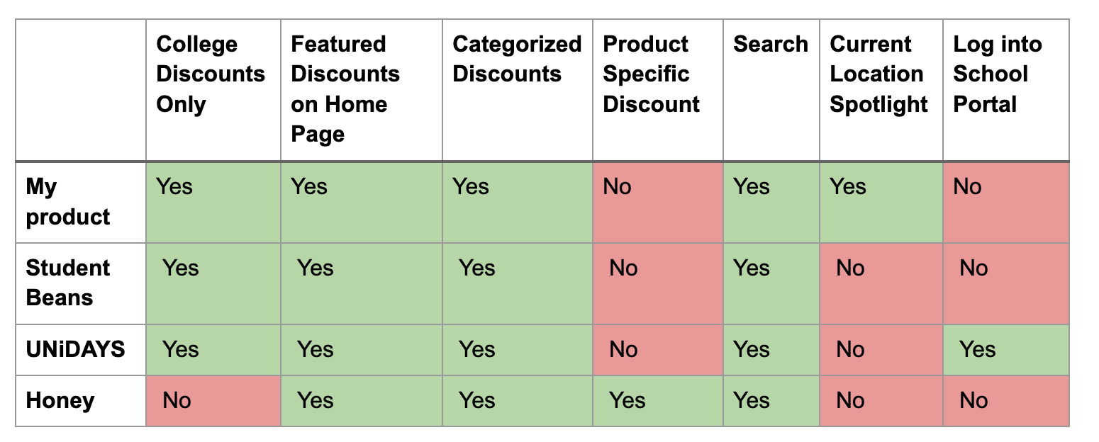
Competitive Analysis
"How might we provide students a way to verify their status as a student without being intrusive?"
"How might we provide the most relevant discounts for particular users?"
"How might we show discounts of potential interest without students searching for them?"
Design
Problem Statement
College students need a more tailored discount finder because
current student discount experiences are overwhelming.
Golden Path
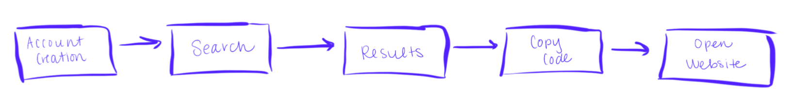
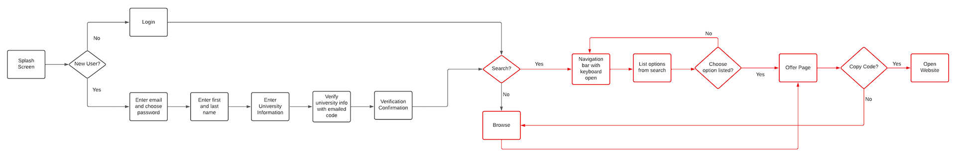
User Flow
Wireframes
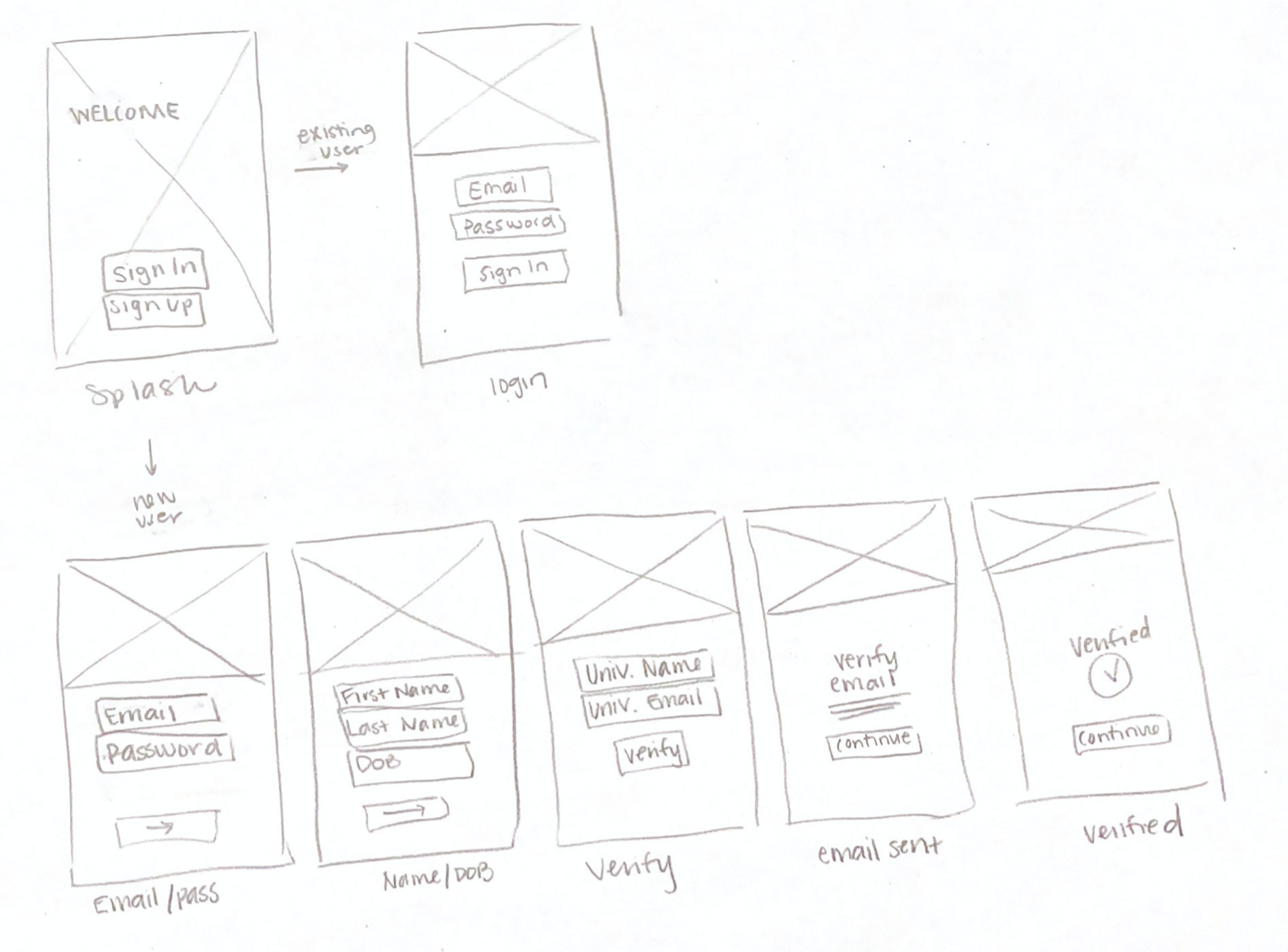
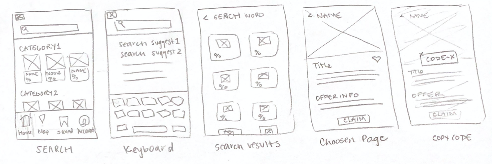
Low Fidelity Wireframes
Mid-Fidelity Wireframes
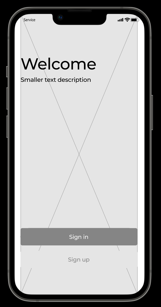
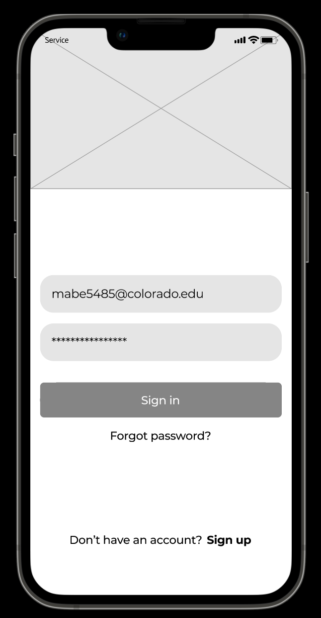
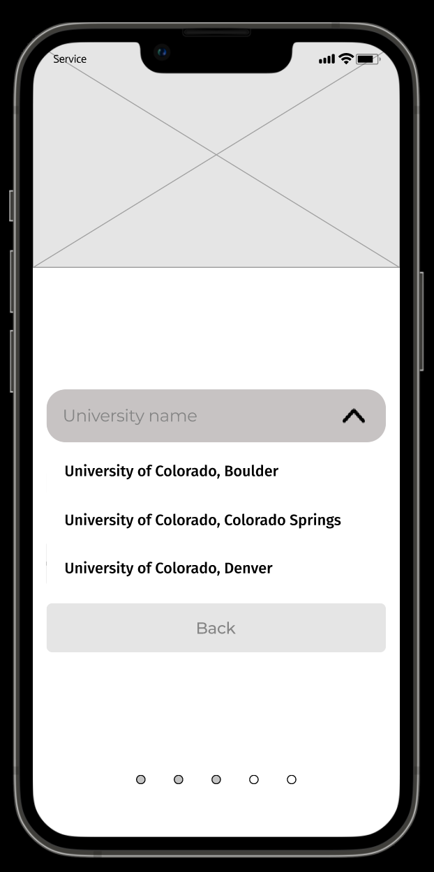
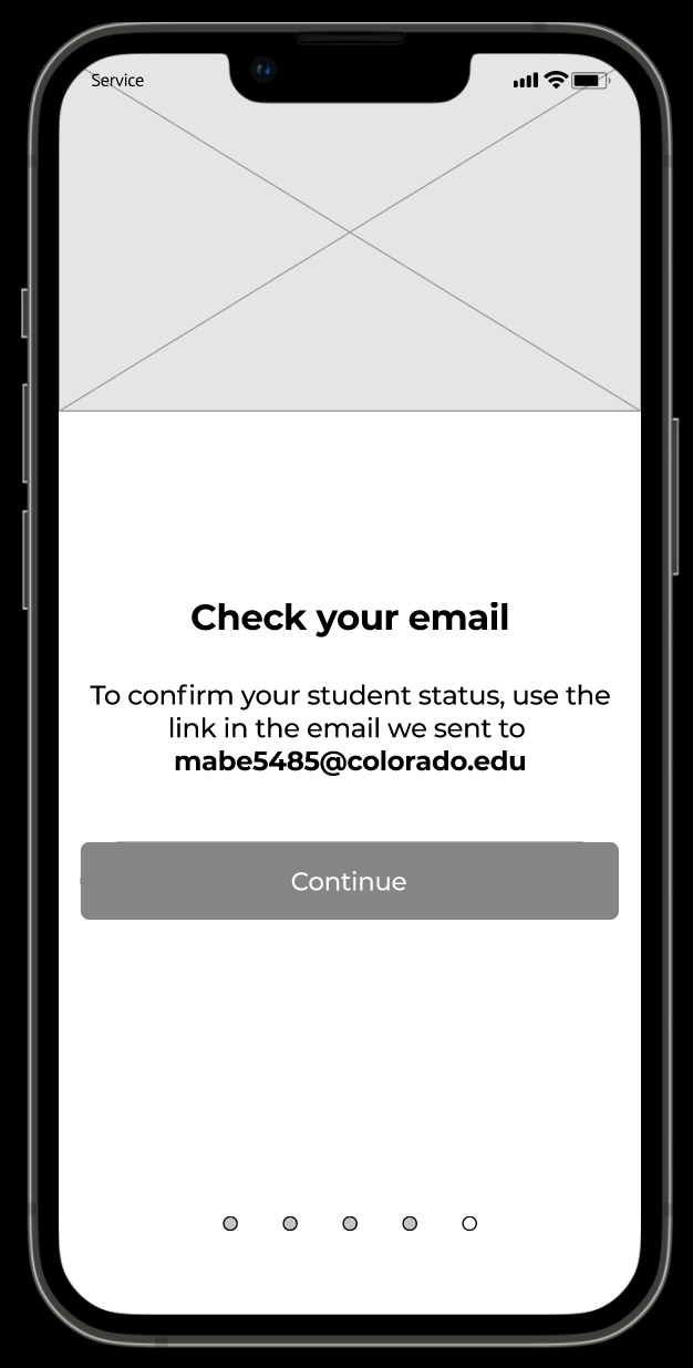
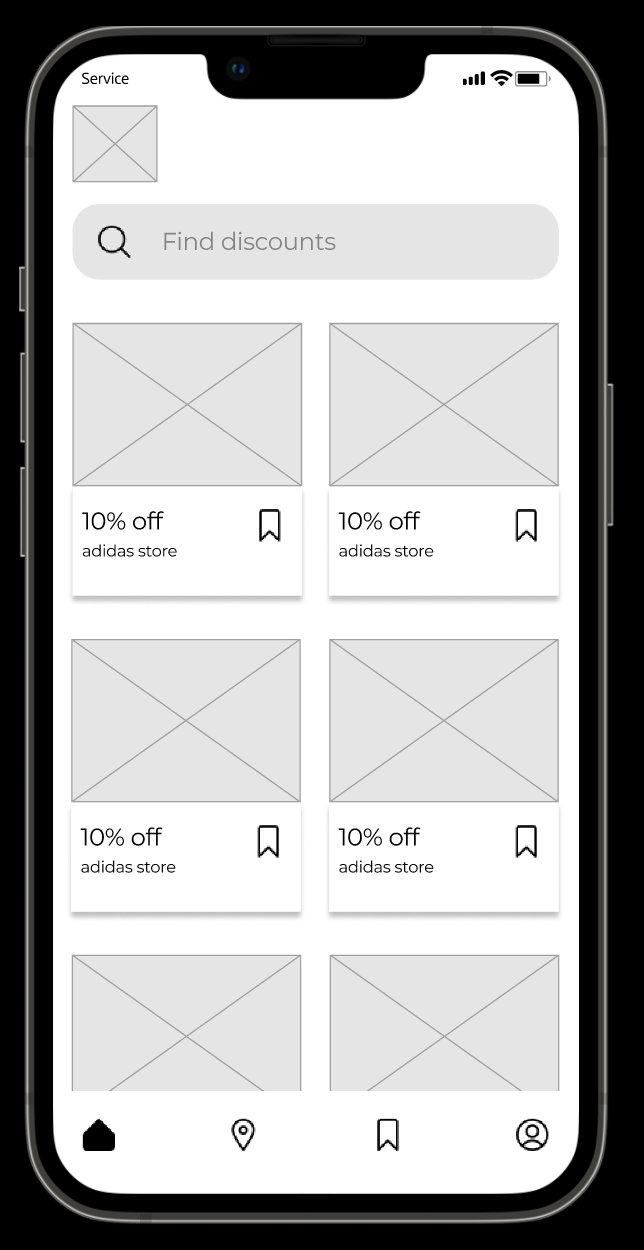
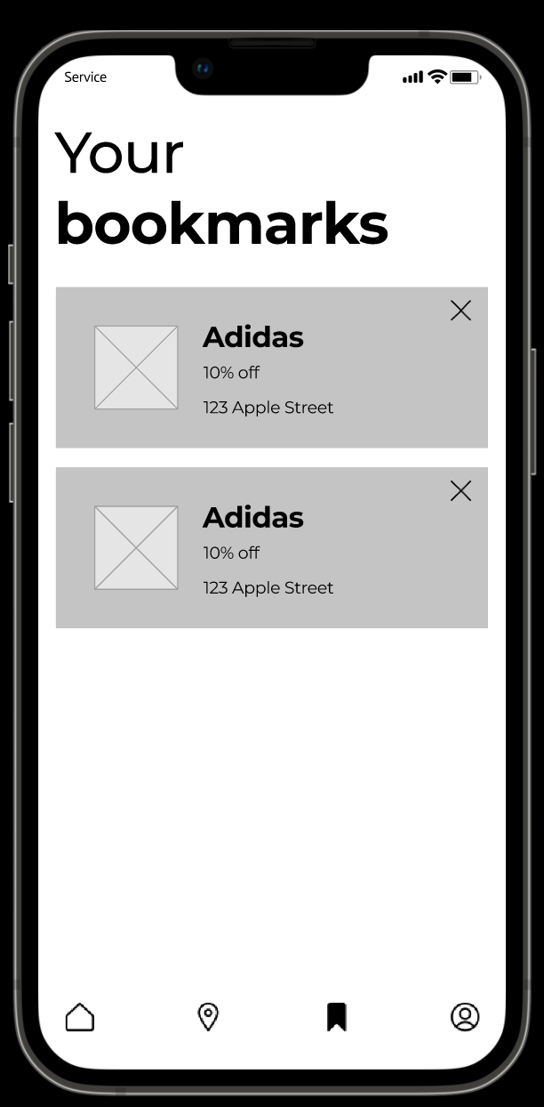
High Fidelity Wireframes
Brand Identity
Word Descriptions
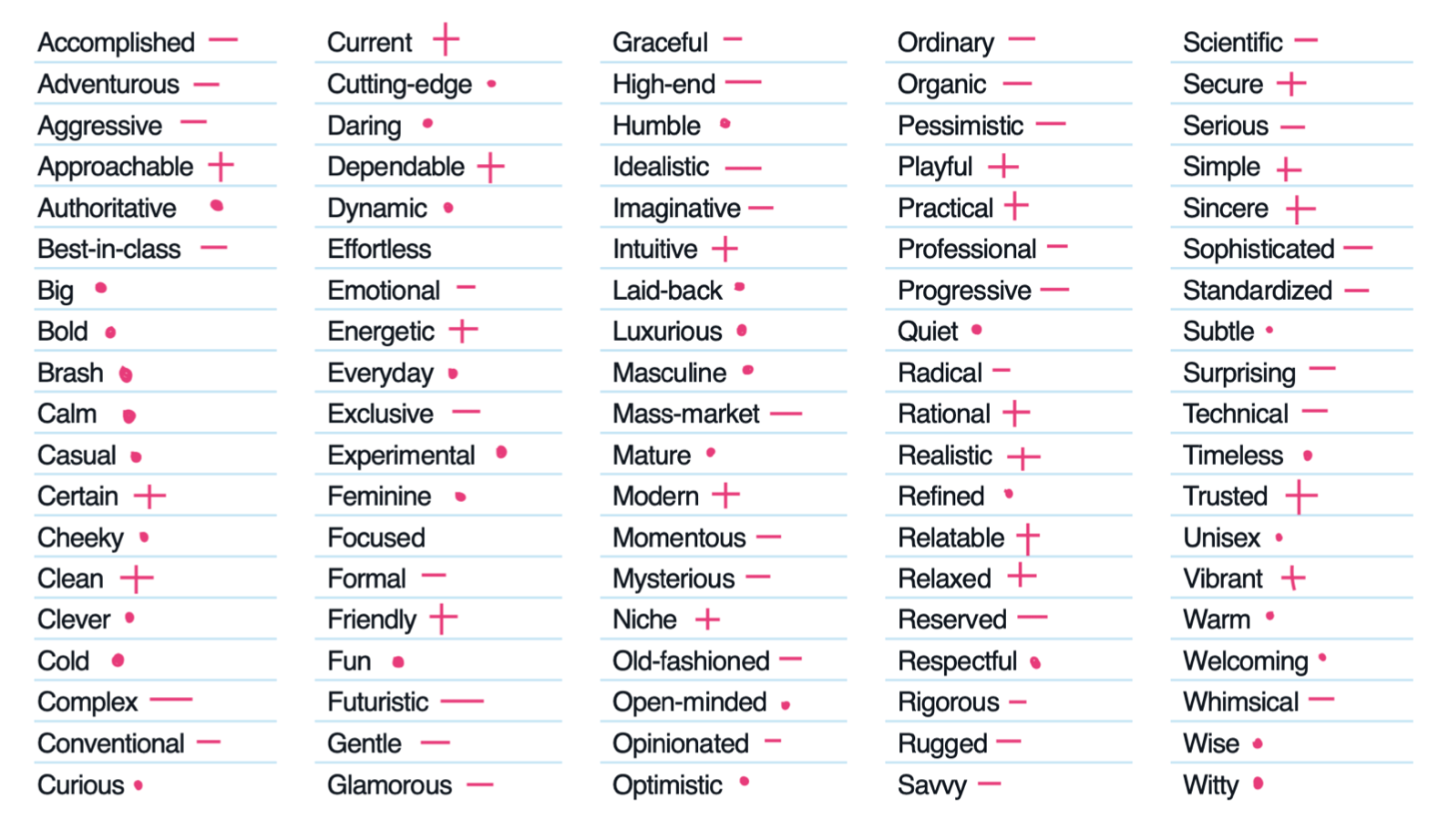
After reviewing a bank of words that could pertain to my app, I marked those that apply with a "+", those that don't apply with a "-", and those that are neutral with a "*"
I wanted my app to be...
Intuitive but not ordinary
Trusted but not conventional
Vibrant but not imaginative
Dependable but not standardized
Trusted but not conventional
Vibrant but not imaginative
Dependable but not standardized
The traits that I found to best describe my digital experience were:
Intuitive
Trusted
Vibrant
Dependable
Friendly
The traits I wanted my experience to avoid were:
Complex
Exclusive
Technical
Imaginative
Standardized
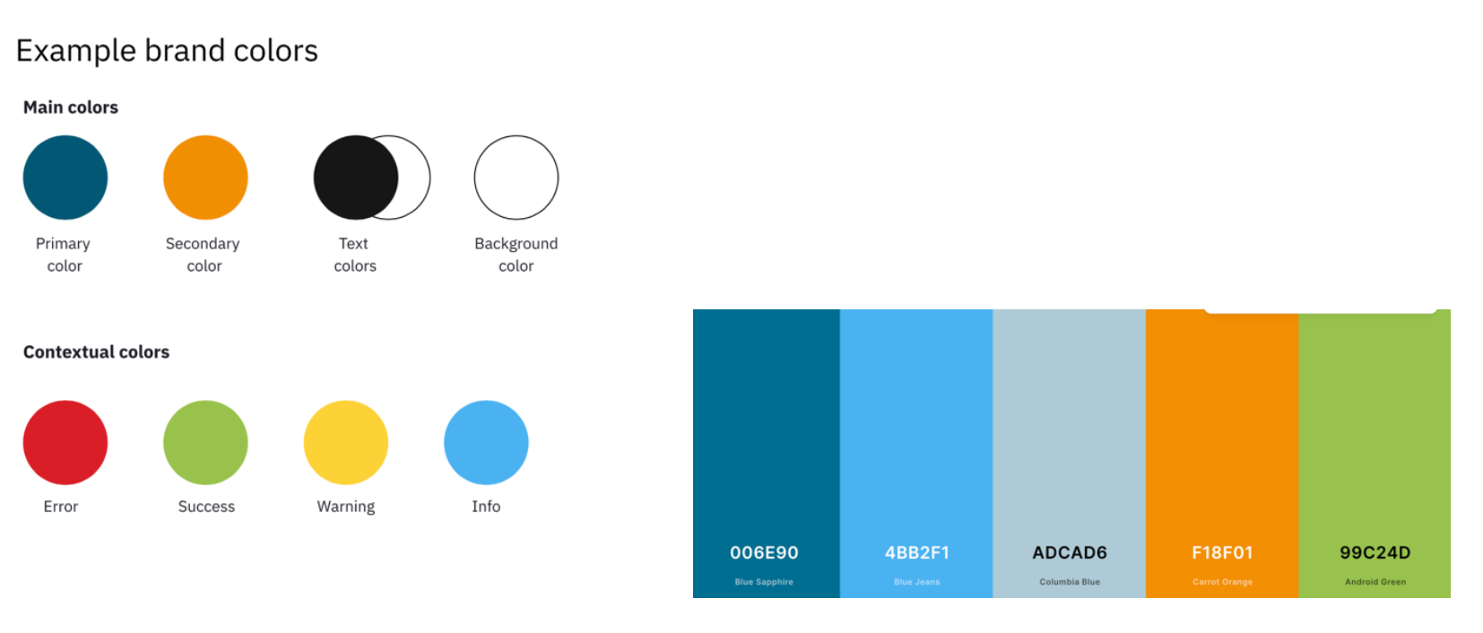
Color Palette
Based on my branding, I decided blue would be the primary color as it represents trust and competence. I decided to use orange for my secondary color because it represents confidence.
I decided my background color should be light themed to allow for the colors to stand out.
White text color meets the contrast ratio requirements for the blue primary color and black text color meets the contrast ratio requirements for the orange secondary color.
My contextual colors are the typical mappings: error (red), warning (orange), success (green), informational (blue).
Evaluation and Results
Peer Feedback
During a peer feedback session, I performed an unmoderated usability test with 2 different participants. During this test, I heard a few things:
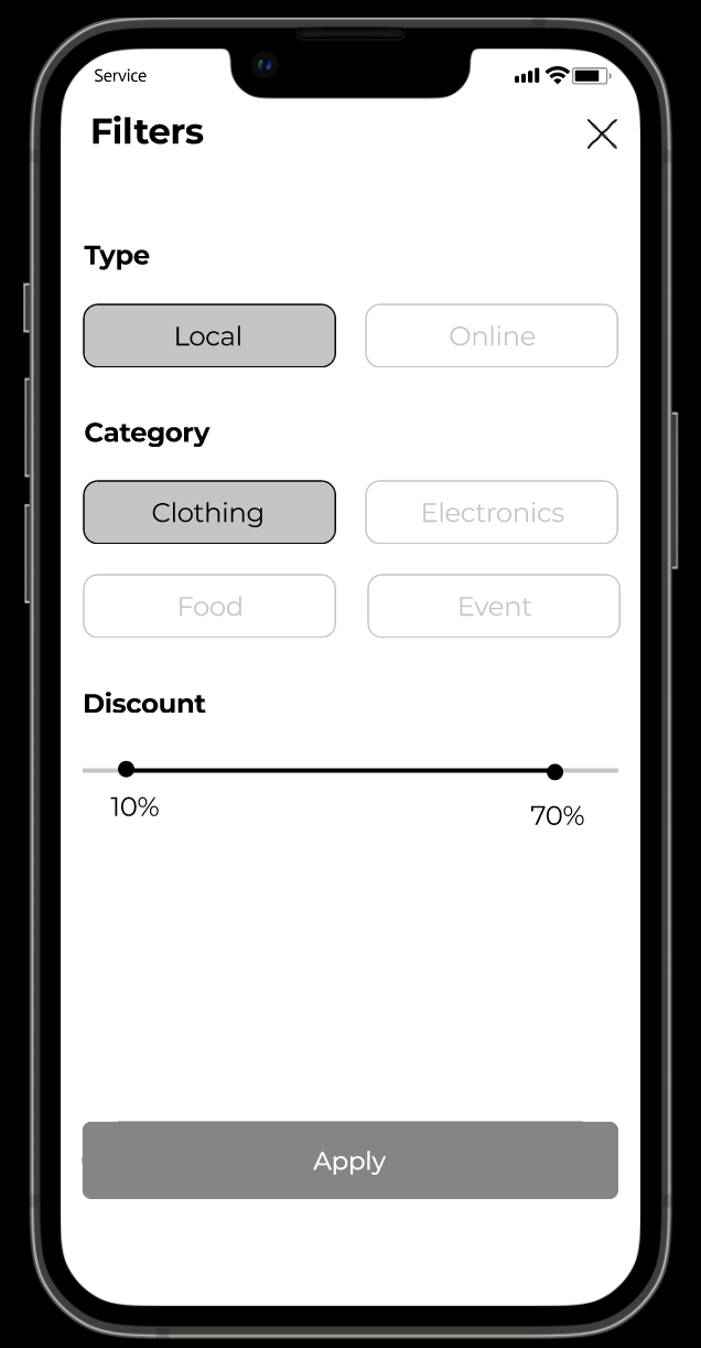
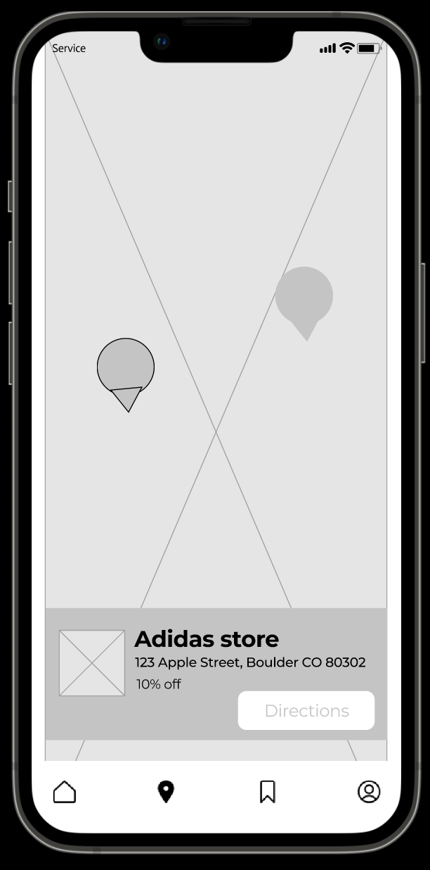
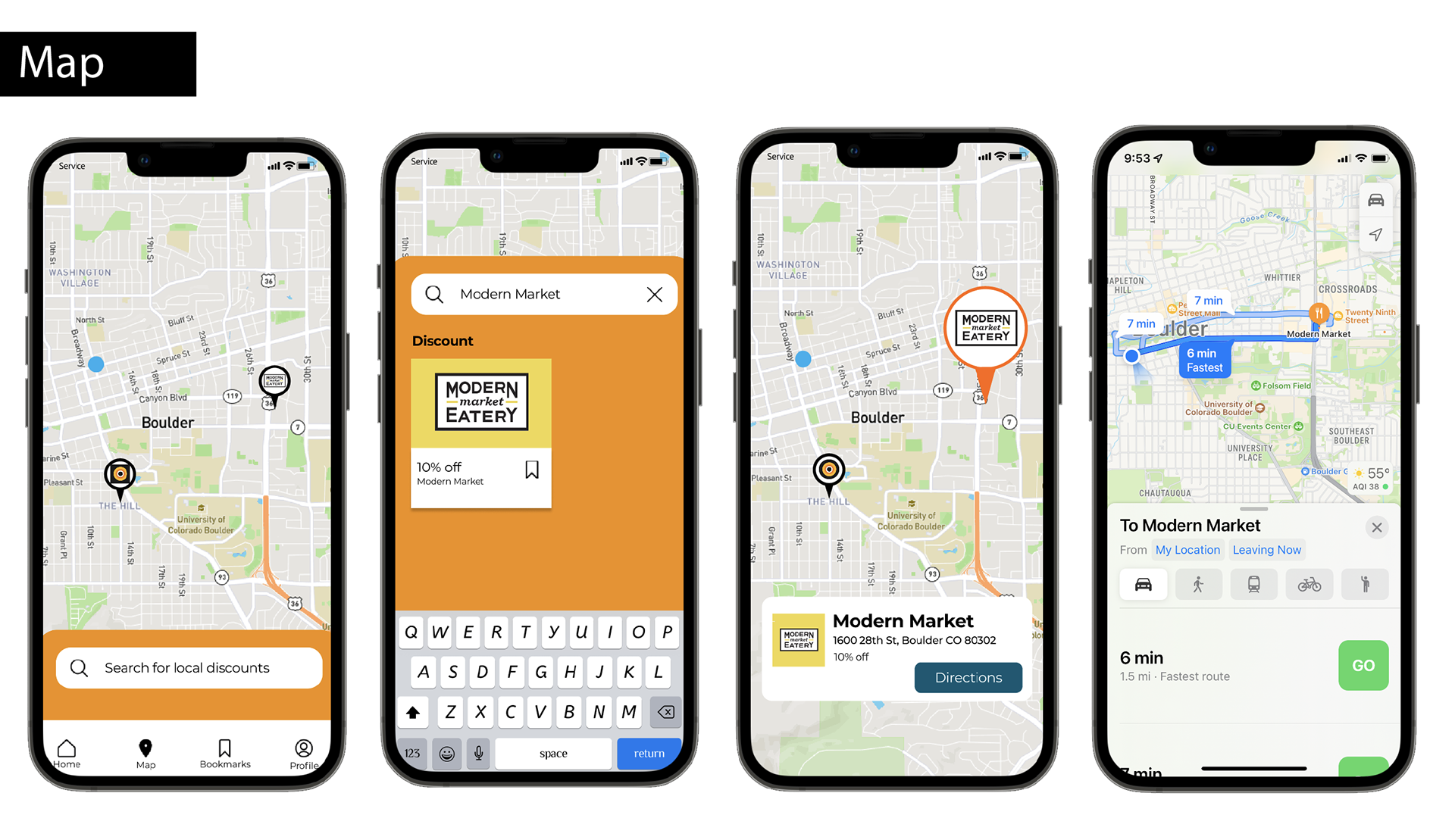
1 - on the map page, users wanted the ability to search
2 - on the map page, users wanted to see where they were
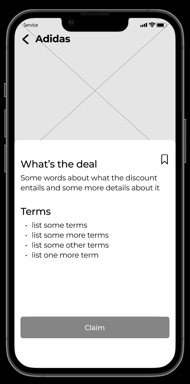
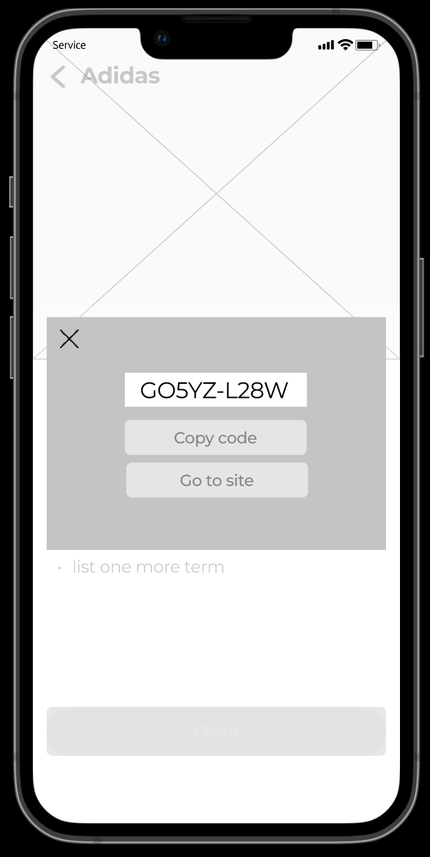
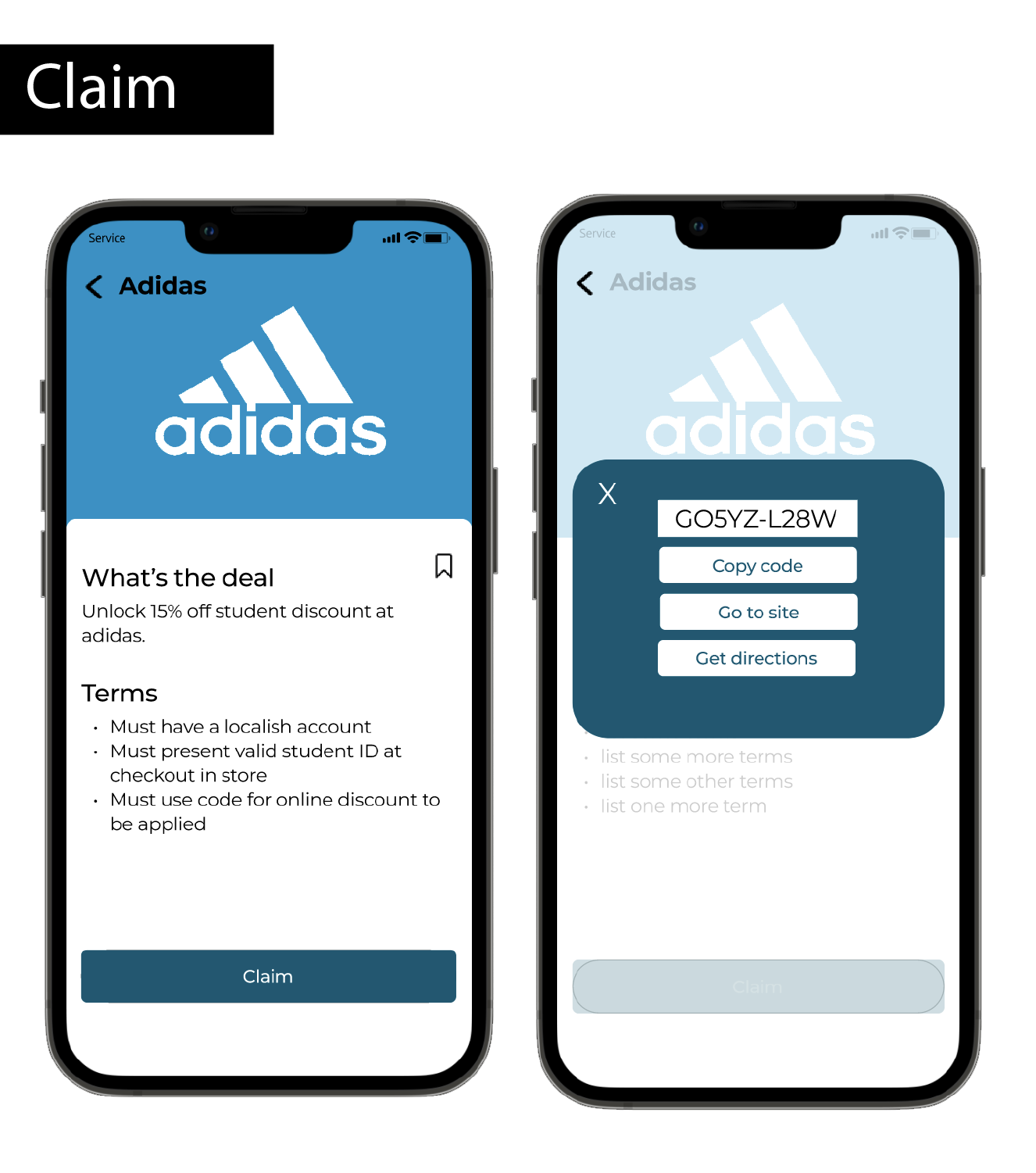
3 - on the discount page, users wanted to be able to get directions to the store
Design Changes based on Peer Feedback
Based on this feedback, I implemented a search feature for the map and also created an icon to show current location. I also provided the user with both website navigation and physical directions so that they could choose to go to the online site or the physical location.
Reflection
Lessons Learned:
Understanding the difficulty of having brick and mortar and online access to stores
In designing a hybrid in person and online discount finder, I quickly realized that finding clear and concise ways to explain to the user which listings were which, and providing accurate ways of using the discounts was a difficult task.
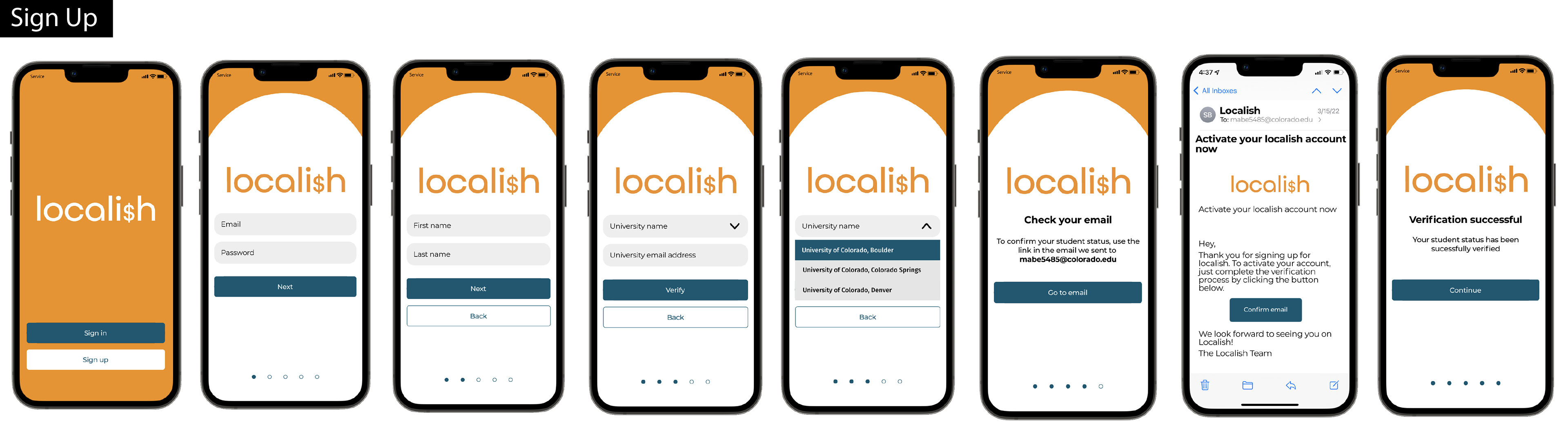
Concise navigation when it comes to school verification
In trying to verify that new users are students, it proved difficult to find an easy way to find their university and verify their email address. With so many different schools and portals, this process showed quickly to be much more involved than initially thought.
Future Plans:
With more time to work on this, I would expand the features of the map to be more dynamic and realistic. I think that the map feature is a good mapping to word of mouth communication about discounts in the area. I would also want to add a chat or social board where users can post about their favorite discounts or share discounts with others.